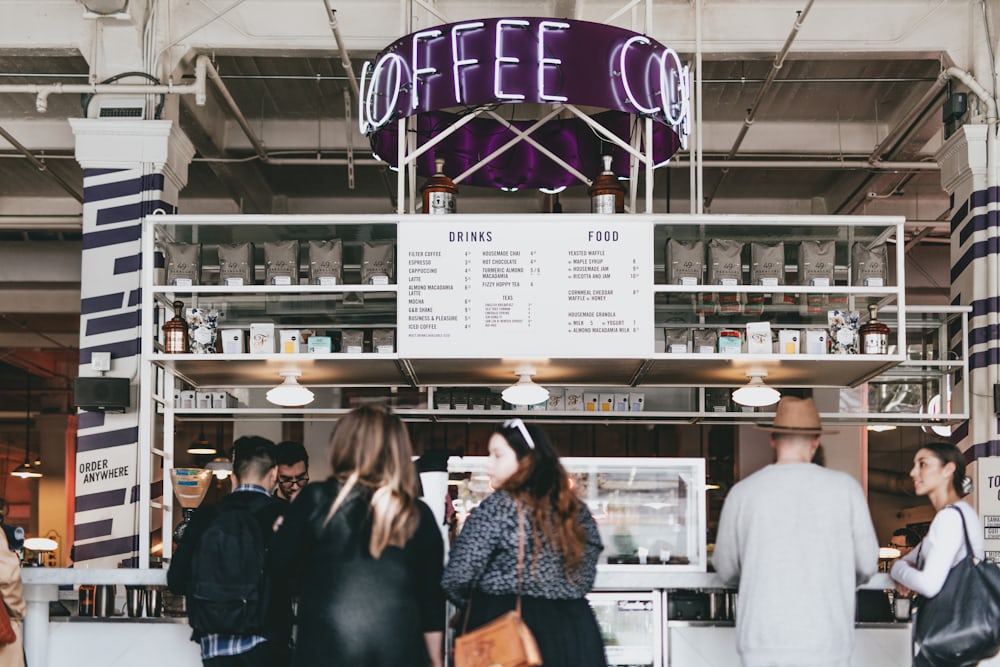
In the bustling world of retail and commercial spaces, the design of effective layouts is crucial in maintaining a seamless flow between loading zones and customer areas. Creating clear distinctions between these spaces not only enhances operational efficiency but also improves customer experiences. This blog will guide you through the importance of thoughtful layout design and offer practical tips to optimize your space for both function and aesthetics.
The Importance of Thoughtful Layout Design
When it comes to managing a retail or commercial space, layout design is more than just an aesthetic choice. It serves as a fundamental factor that influences the flow of goods and people. A well-thought-out design ensures that loading zones are efficiently used while keeping customer areas welcoming and accessible. This separation helps in minimizing disruptions, maintaining safety, and ensuring that operations run smoothly.
A strategic layout can boost productivity by streamlining processes—from the point of arrival of goods to their display on shelves. It also plays a vital role in improving customer satisfaction, as it reduces noise and visual clutter, creating a more pleasant shopping experience. Additionally, a functional layout enhances employee performance by allowing them to carry out their tasks without interference from customer traffic.
Balancing Functionality with Aesthetics
Balancing functionality with aesthetics is key when designing spaces that accommodate both loading zones and customer areas. While the primary goal is to ensure operational efficiency, the visual appeal of the space should not be overlooked. A well-designed space attracts customers, encourages longer stays, and increases the likelihood of repeat visits.
To achieve this balance, consider using design elements like color schemes, lighting, and materials to create visual separations. These elements can help delineate areas without the need for physical barriers. For instance, different flooring materials or colors can be used to distinguish loading zones from customer spaces, subtly guiding the flow of traffic.
Practical Tips for Distinguishing Loading Zones
Use of Signage
Effective signage is a simple yet powerful tool to clearly demarcate loading zones. By placing signs that indicate restricted areas or direct pathways for delivery personnel, you can prevent unauthorized access by customers. Clear and visible signs ensure that everyone knows where they should be, minimizing the risk of accidents or confusion.
Physical Barriers
Installing physical barriers like bollards or railings can effectively create boundaries between loading zones and customer areas. These barriers can be both functional and stylish, contributing to the overall design of the space. For example, a well-placed railing can guide foot traffic while also serving as a design feature that enhances the aesthetic appeal.
Strategic Placement of Entrances and Exits
The placement of entrances and exits plays a significant role in directing traffic flow. By positioning loading zone entrances away from main customer entries, you can reduce the likelihood of overlap between delivery activities and customer movement. This strategic placement ensures a smoother operation and a safer environment for everyone.
Enhancing Customer Spaces for Better Experiences
Open Layouts for Easy Navigation
Creating an open layout in customer areas enhances the shopping experience by making navigation intuitive. Customers appreciate spaces where they can move freely without feeling cramped or obstructed. An open layout also allows for better visibility of products, encouraging impulse purchases and boosting overall sales.
Comfortable and Inviting Atmosphere
A welcoming atmosphere is key to customer satisfaction. Incorporate comfortable seating, attractive displays, and ambient lighting to create an inviting environment. Thoughtful design touches can transform a simple shopping trip into an enjoyable experience, increasing the likelihood of customers returning.
Incorporating Natural Elements
Bringing natural elements into customer spaces can significantly enhance their appeal. Plants, natural light, and earthy tones create a calming environment that customers find refreshing. These elements can also serve as subtle dividers between areas, offering a seamless transition from one section to another.
Incorporating Safety and Accessibility
Safety and accessibility should be at the forefront of any layout design. Ensuring that loading zones are separate from customer areas minimizes the risk of accidents and injuries. Accessibility features like ramps, wide aisles, and clear pathways make the space user-friendly for everyone, including those with disabilities.
Proper planning and design can prevent potential hazards and ensure compliance with safety regulations. Regular assessments and updates to the layout keep the space functional and safe as business needs evolve.
The Role of Technology in Space Management
Integrating technology into space management can greatly enhance efficiency. Tools like digital signage, automated doors, and traffic sensors can streamline operations and improve customer experiences. Technology allows for real-time monitoring and adjustments, ensuring that the space remains optimal for its intended use.
Conclusion
Designing effective layouts that clearly distinguish loading zones from customer spaces is a vital component of successful space management. By focusing on both functionality and aesthetics, businesses can create environments that enhance operations and delight customers. Implementing practical design strategies and leveraging technology ensures that your space serves its purpose efficiently while offering a pleasant experience to all who visit.
For businesses looking to optimize their space, consider exploring options like fence installation in Richmond to enhance both the functionality and security of your layout. By taking proactive steps, you can ensure your space meets the needs of your business and your customers alike.


